-

Inclusion: The Missing Ingredient

In the film Ratatouille, Chef Gusteau would tell all that visited his restaurant that anyone can cook. He inspired the rat in the film, who went on to make masterpieces, and real life brand Maggi believed the same.
Known for noodles, soups, and seasonings, the Swiss brand’s products are used in kitchens all over the world by professionals and the more casual cook at home. Maggi knew their reach could go even further. In Brazil, they worked closely with the Dorina Nowill Foundation for the Blind. The result was a multi sensory cookbook, which Maggi titled Cooking Blindly, or “Cozinha às Cegas” in Portuguese.
The book is a 130 page work of art. It combines the creativity of cuisine with so many different design ideas, stimulating as many of the five senses in every way it can.

There are embossed images so readers can feel the textures of ingredients, as well as Braille to read.
There are audio descriptions and sounds of sizzling steaks, so readers know what to listen out for.
There are local spices and fragrances behind tabs, so readers know what goes well together, appealing to the sense of smell.
For those with low vision, the pages are charcoal black with bold large type in the signature Maggi colours of mustard yellow and chilli red.

There are even tools tailored to help making cooking easier, like thermometers that say the temperatures aloud.
All these innovations, it’s like they thought of everything.
Alexandre Munck, Executive Superintendent at the Dorina Foundation said, “Everyone has the right to learn and be able to prepare their own food.”
Chef Gusteau couldn’t have said it better.
-

Learn and Lego
Reading, Writing, Arithmetic. These are the Three R’s of Education, even though only one word actually begins with the letter R.
But now Lego have stepped in to change things for the blind community and people with low vision, with the Three B’s.
Braille Building Bricks.
The Danish toy brand developed bricks with the help of blind organisations from all over the world, with the traditional studs on top forming individual letters and numbers in Braille.

Lego first announced these bricks to the world in 2020, and gave them to schools to encourage children with a fun way to learn. Technology has made things easier, with text readers for example, but many say that having the option is always better. The European Blind Union says that having an understanding of Braille helps in higher levels of education and can lead to better jobs.
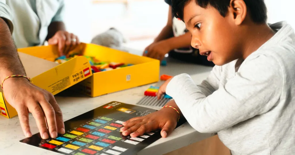
This September, Lego released packs for the public to buy in the UK, which they hope will lead to a closer bond between parents and children as they learn braille together. Available from Lego.com, packs of bricks come in five colours, have fun online classes to go along with them, and they can fit with other Lego sets.
Because Everything Is Awesome when you’re part of a team.
-

Alt Text, Where You @?
Threads, Mark Zuckerberg’s newest social media platform, arrived on July 5th. Gaining 100 million users in the first five days, it quickly tried to position itself as the successor to Elon Musk’s X, formerly known as Twitter.
Most things that Meta have come up with build on existing ideas, and in this case there was a clear and known framework to follow and improve upon. They started off strong by targeting those who had left Twitter after Musk made some less than popular changes. Threads’ key advantages are posts can have longer text, and you can upload longer videos than you can on an unverified X account.
However, there are some aspects that have not been taken on, and it has raised some questions.
One of these features is replies. When you reply to a post on the X app, the most recent responses can be seen first. Threads shows them the other way around, with the oldest reply first, making it difficult to tell the order of a back and forth discussion.
Also currently missing from Threads is the ability to use Hashtags. They make it easy for a community to find similar themes and discussions, but at the moment, hashtags do not connect to one another.
Trending topics make it easy to find out what’s happening in the world, but this too is absent from Threads.
And then there’s alt text.
It might be a bit much to think Threads should be a complete copy of X, so there should be some things to keep them separate. However, Alt Text should not have been one of those things.
User generated alt text is the written description that explains an image, so the wider community has access to the same information, even with limited vision. It is important for making any brand inclusive, especially a social media platform like this. Putting the function on shouldn’t even be hard. Usually a small button to click, and everyone is on the same page.
Zuckerberg has since made a statement that alt text, among other things, will be addressed over the course of August. Except, Zuckerberg is the CEO of Meta, who own Facebook and WhatsApp. He’s been involved in communication for so long that something like this shouldn’t have been missed. It leads me to ask why nobody thought of sorting things like this for all users from the beginning. Currently, some people are able to upload images and videos with alt text, but many others still don’t have the function.
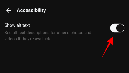
In the device settings, go to the accessibility drop down, and the alt text function button might be available to switch on.
Coming from the team behind Instagram, a site that is mostly about the visuals, Threads should have been able to set itself up as a positive force for creativity and diversity, having learned what works for other social media platforms. The Threads Project Head, Adam Mosseri, said that the difference between Instagram and Threads is not about “text versus photos and videos, and more about what public conversations you want to have”. Yet they proceeded to leave out an aspect that would make those conversations so much easier. Overlooking something as fundamental as that upon launch makes it seem as though it was an afterthought. Definitely not a good look.
-

Barbie and her journey of diversity
Ruth Handler wasn’t a homely woman, raising her babies and doing the housework. She was out co-founding a business with her husband that would later take the world by storm. That business was Mattel, started in 1945 and now an international toy enterprise. Ruth never played with dolls herself, but she knew her market. Returning from work, Handler watched her daughter playing with these little paper dolls. You had to cut them out along with their separate clothes, which you then had to attach. She played with them for hours and hours. They’re fiddly and annoying. They aren’t fun. Quite rightly, Handler thought her daughter deserved better.
It was the ’50s, and baby dolls were the one of the most popular toys of the time. Handler wanted her daughter to think that she could be anything growing up, not just a mother and a wife. That wasn’t all that she was, and it wasn’t all she wanted for her daughter. So, in 1959, the first Barbie doll was released. A doll to reflect the modern woman of the time. Barbie wore what she wanted, went where she wanted, and wasn’t relying on a man to look after her.
Fast forward 60 years, and Barbie has had every career going. She wasn’t simply dressing up and going to fancy parties with her tag-along, afterthought boyfriend, Ken. No. She went to the moon. And she did it years before Neil Armstrong did in real life. Laziness on his part if you ask me. She has been a paramedic, a pilot in the Air Force, and a president of the United States. With the world accepting that women could do anything, Barbie was there to inspire upcoming generations.
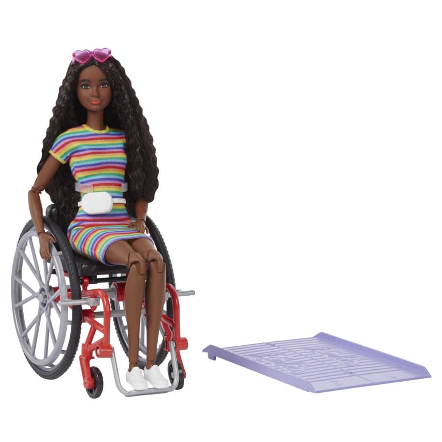
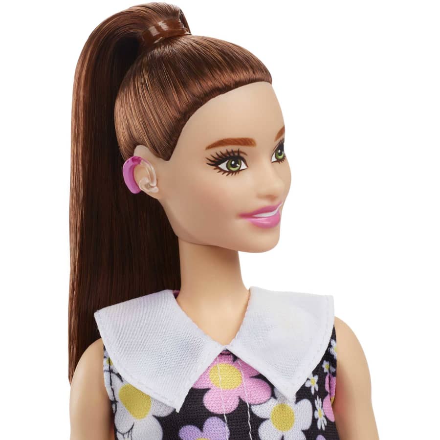
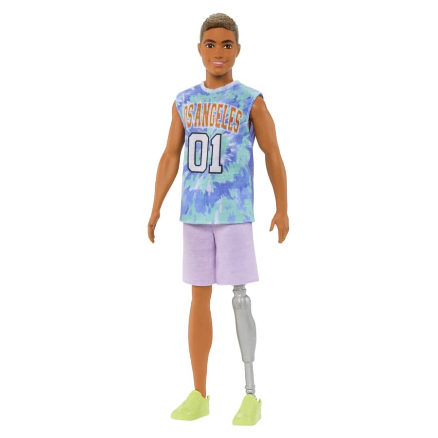
In 2015, the Fashionistas line had hundreds of new designs. There were Barbies with different shapes, skin tones, and heights. This included dolls without hair, some with vitiligo, and a cornrowed Ken. By 2019, dolls were released reflecting disabilities as well, featuring those using wheelchairs, hearing aids, and prosthetics. In the UK, the top two bestselling Fashionista dolls were in fact the ones using wheelchairs.
“Barbie has continued to evolve over the years to better reflect the world girls see today, adding more diversity for endless storytelling possibilities,” Mattel said on their Barbie website.
So, of course, this had to come up in the Barbie film, showing exactly how far times have changed. One of the first scenes is a sequence of very different women, with a voice-over declaring “this is Barbie” for each one of them.
Because Barbie is every woman. Even from the start, her creation wasn’t about her being blonde and white. She was about the joy of growing up and the freedom to do whatever they desired. Not being confined by ideas of gender or disability. She represented a wider world to those who play with dolls. As such, she was always meant to change and embrace all looks and aspects of womanhood.
As I finish writing, I too am embracing these aspects before going to view the film in all its technicolor glory. In an Oppenheimer hat.

Later days,
Petrus
-

Webs of Representation: The Rise of Spider-Verse’s Wheelchair-Using Hero from Fan-Art to Film
2018 was a huge deal for diversity in film. For fans of super heroes, there wasn’t always much in the way of representation onscreen. When Black Panther came out, people of colour finally felt like they had a big name black character to relate to. Spider-Man: Into The Spider-Verse continued that trend with a strong black character in the forefront with a strong family connection and a diverse group of friends all with their own powers, emphasising that nobody is ever really alone and “anyone can wear the mask”. It was a big thing for Miles Morales, the Spider-Man of the story, knowing he wasn’t alone and that he had people out there he could relate to and count on. Community was being embraced, and the world was loving it.
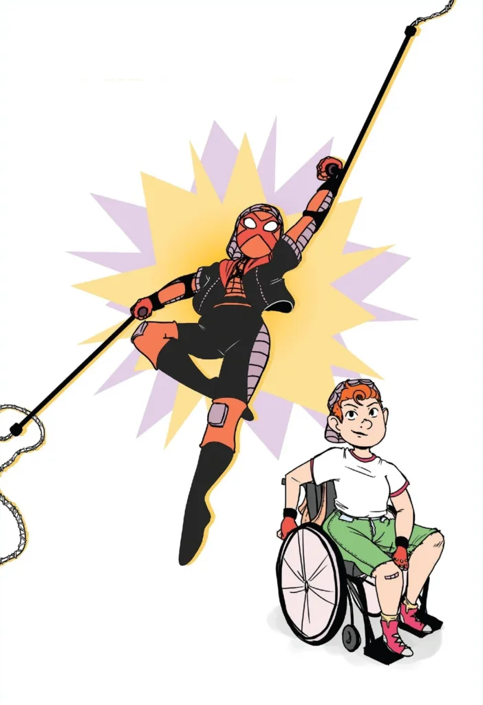
2023, and there’s a new film, Spider-Man: Across the Spider-Verse. As Miles faces a new threat too big for him to deal with alone, he meets the Spider Society. This is a team of the best Spider-people from multiple realities, brought together by Miguel O’Hara, the Spider-Man of 2099. After helping Spider-Man India in his reality, Miguel and Miles disagree about how to handle a forthcoming “canon event”. Miguel says a tragic event has to happen in Spider-people’s stories to make them the heroes they’re meant to be. Miles refuses to accept that, and flees from the Society to find a portal back home. Miguel sends everyone after him, leading to a huge chase scene featuring a Spider-Mobile, a Lego Spider-Man, and a Spider-Cat. As Miles tries to escape, he encounters a Spider-person in a wheelchair. A wheelchair that is crawling on the ceiling. She leaps down to hit him with her crutches, making a comment about Spider-people tending to use humour as a crutch, before acknowledging the poor joke.
Turns out this was Sun-Spider, a Spider-Woman with Ehlers-Danlos Syndrome, a condition that affects connective tissue, and can impact joint movement, meaning sometimes there is a need for help walking.
The buzz surrounding the first film allowed fans to make versions of themselves as characters in the film, creating their own fan art “Spider-sonas” online. One such fan was Dayn Broder, a comic editor, illustrator, and freelance writer with Ehlers-Danlos Syndrome. Her character, Sun-Spider, even uses her crutches to webswing.

There’s no reason why a person with mobile disabilities shouldn’t be out there saving the world; Spider-Man was the first comics character to fully cover his face with his costume, and even in that, it meant anyone could wear the mask.
“As a disabled person, I almost never get to see any disabled super heroes,” said Broder.
“I wanted to create someone like me: an ambulatory wheelchair user, who can still kick butt in her own modified way. Sun-Spider is hyper-flexible, though this does have drawbacks since it means she requires extra stability, and the crutches help with that.”
Something Marvel Comics editorial loved so much that, for their 2020 Edge of Spider-Verse crossover event, Broder was contacted to incorporate the character, with “Charlotte Webber” getting her own individual storyline fighting her own version of Doctor Octopus at prom.
It all came full circle when Sun-Spider was recruited to help in the events of Across the Spider-Verse, where she is voiced by wheelchair-using comedian Danielle Perez.
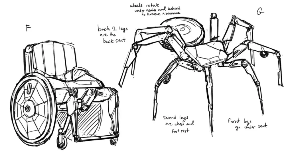
“I screamed when I saw the wheelchair mech!! what an amazing design!”
Understandably, Broder was very happy upon seeing the way the film had incorporated the wheelchair and how its worked with Sun-Spider’s abilities. Character designer Kris Anka took the best parts of Broder’s initial drawings and really brought them to life.
She might have been at odds with Miles in the film’s climactic chase scene, but she was a hero in her world. And in our world, where we love to see heroes surpass barriers, the Spider-Verse continues to weave a web of inspiration and inclusivity, inviting us all to join the fight.
-

Make your content easier to read by using accessible typography
How you write can make your content easier or harder to read. But that’s not all that affects the readability of your content. Ensure your message is easy to access by making accessible typography choices.
Why does accessible typography matter?
Decisions about font style, type size and layout can make a huge difference. They can affect whether people can read and engage with your work or are not able to use it at all. Coming up we’ve got four quick and easy tips to make your typography accessible.
These can be applied to all your digital media or products. Use these tips on your website, on social media graphics, in ebooks and in any other content.
4 typography tips to make sure your audience gets your message
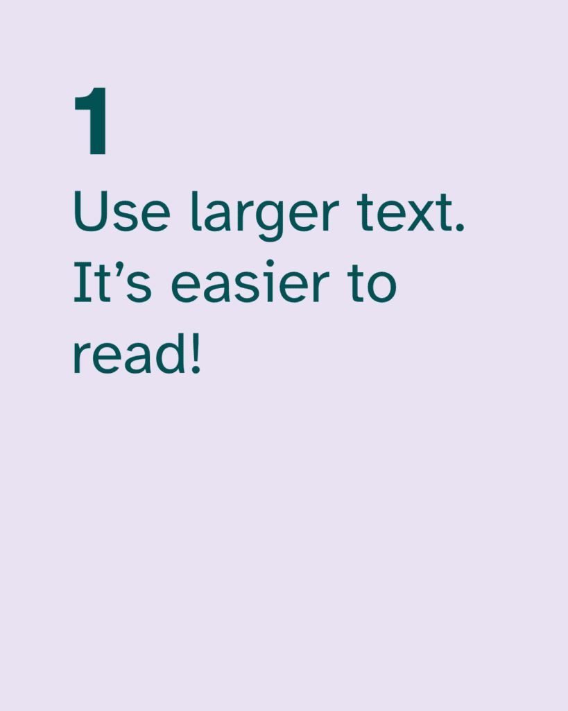
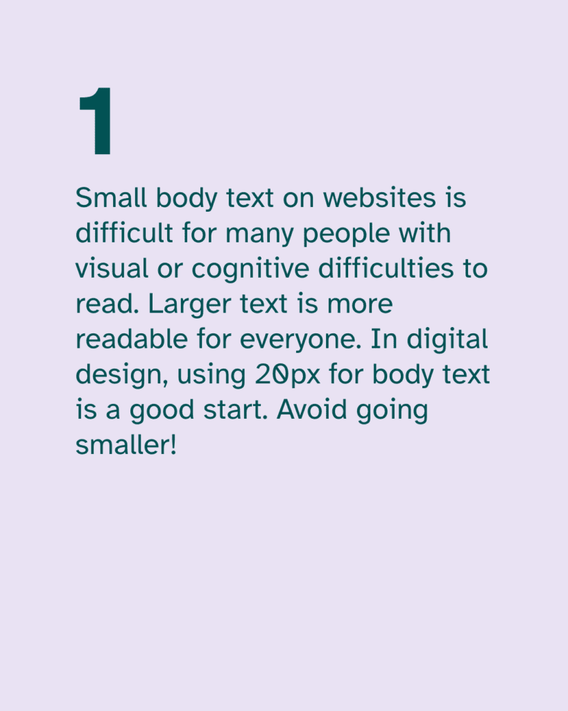
1. Use larger text. It’s easier to read!
This is such an easy change to make. It can make a quick and big difference in how accessible your content is. And yet many people will argue against this.
You might hear comments like “big text is clunky”, or “it’s childish”. Unfortunately, this is an ableist attitude that is all too common. Let’s prioritise accessibility so that your audience can engage with your work.
The bottom line is that small body text on websites is difficult for many people to read. Larger text is more readable for everyone. In digital design, using 20px for body text is a good start. Avoid going smaller.
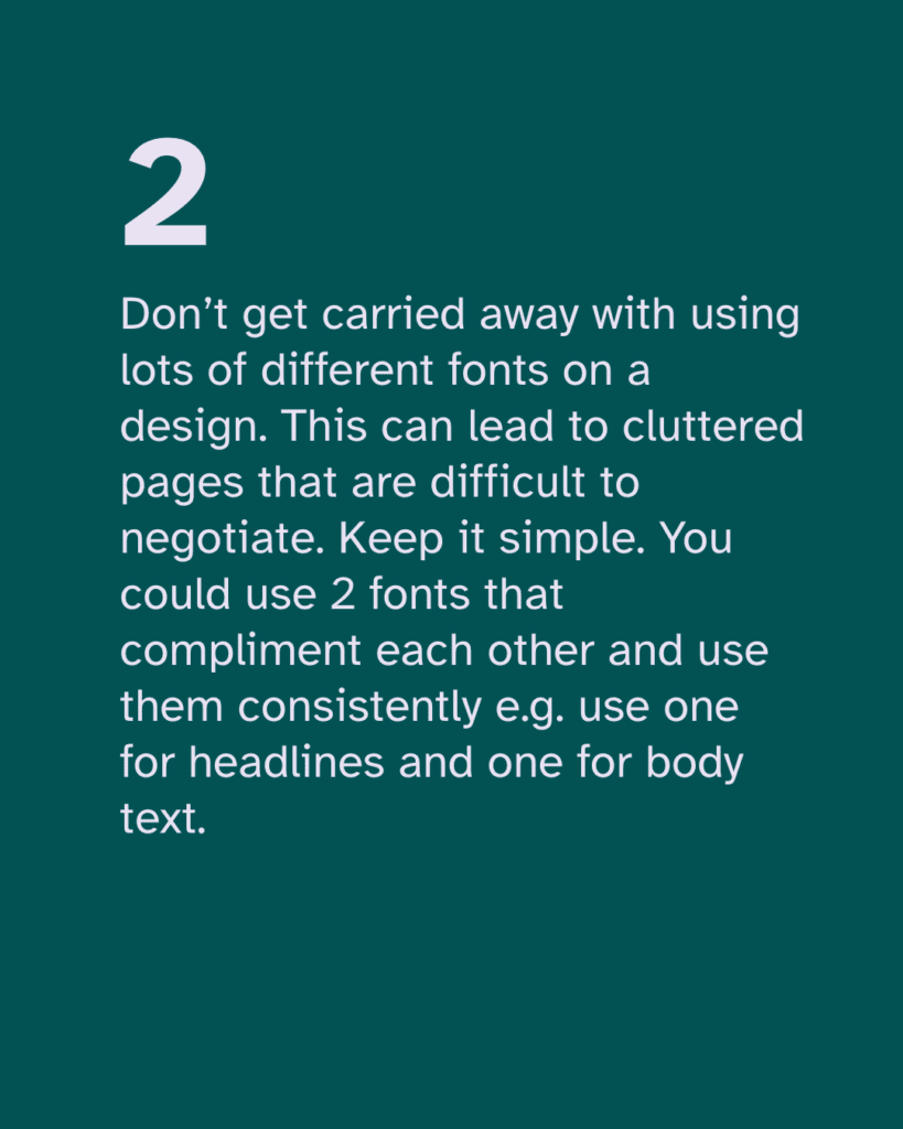
2. Don’t use lots of different fonts!
With so many font options out there, it can be tempting to use lots of different fonts on a website page or social post. But this can be distracting and make it harder for people to read your text.
Don’t get carried away with using lots of different fonts on a design. This can lead to cluttered pages that are difficult to negotiate.
Keep it simple. You could use 2 fonts that complement each other and use them consistently. For example, use one for headlines and one for body text.

3. Common fonts can be accessible fonts
Again with lots of exciting new fonts to choose from, we can forget that familiarity is not a bad thing. There is a lot of debate about which are the best fonts for accessibility.
Different disabled people may have preferences for different fonts. While no one best font suits everyone, familiar fonts are often easier for most people to read.
When it comes to choosing, go for common fonts that many readers will be familiar with reading in. These include sans-serif fonts like Arial, Calibri, Century Gothic and Tahoma. Common serif fonts include Times New Roman and Georgia.


4. Avoid fonts that don’t have distinct characters
Some fonts don’t have distinct characters. For example in Gill Sans, I, l and 1 look exactly the same. This makes the text more difficult to read for many people.
And if the letters b and d are too similar in shape, readers can confuse them. Look for fonts that have distinct characters like PT Mono or Comic Sans.


We also recommend a font called Atkinson Hyperlegible, which is specially designed to have highly distinctive characters. Find out about this accessible font here.
Follow these four tips to help you make your content inclusive. Accessible typography makes digital spaces easier to use for many people. This can include dyslexic and other neurodivergent people, plus people with visual conditions.
We’ve got lots more info on typography accessibility coming soon. Look out for information in our resources and on our blog.
-

Finding the most accessible font is easier than you might think!
Which fonts are easiest to read?
Are you struggling to find an accessible font to ensure your content is inclusive? There’s a lot of discussion and disagreement about the best fonts for accessibility. Some fonts are easier to read than others, and there are a few good options. Here’s an example of a great font that we know is readable and accessible.
It’s called Atkinson Hyperlegible. Applied Design Works designed the font in partnership with the Braille Institute.
Atkinson Hyperlegible font is unique because it was designed to increase legibility. This is one of the reasons why it’s one of the best fonts for readability. And it’s free too!
Atkinson Hyperlegible font
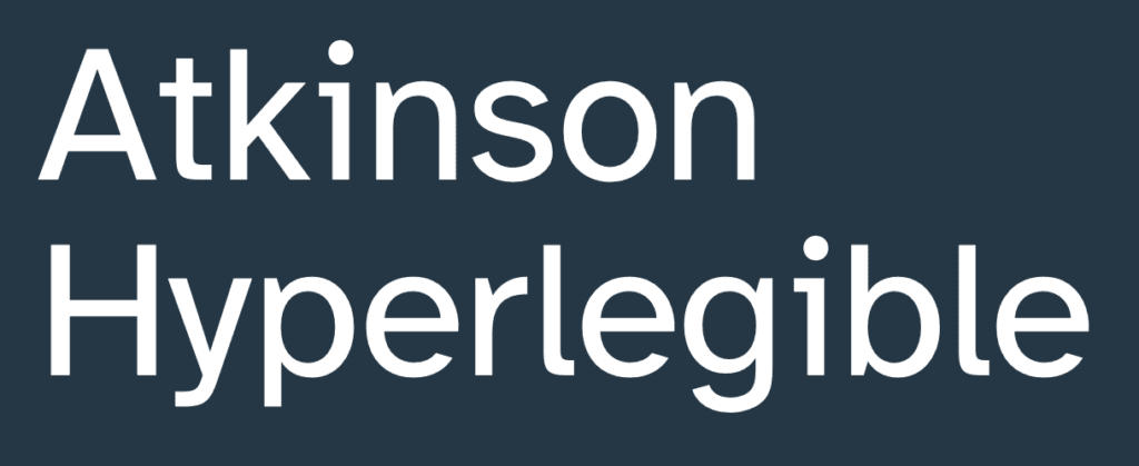
Atkinson Hyperlegible is a sans-serif typeface. Read on to see how Atkinson Hyperlegible works and why it is so helpful. The font won Fast Company’s 2019 Innovation By Design Award.
An accessible font for visually impaired readers
Low-vision readers can struggle with certain letters. Some numbers can also be hard to distinguish from each other. This typeface differentiates common misinterpreted letters & numbers using various design techniques.

Recognisable footprint
Character boundaries are clearly defined to ensure understanding across the visual spectrum.

Differentiated letterforms
Similar letter pairs are differentiated from each other to increase legibility dramatically.

Unambiguous characters
Unambiguous characters increase legibility for people with low vision. Being dyslexic can also make it more difficult to read letters which are similar in shape. So this also makes Atkinson Hyperlegible one of the best fonts for dyslexic people.

Exaggerated forms
These clarify potential misreadings.

Opened counterspace
These define open spaces better.

Angled spurs
These increase recognition and define distinctive styles.

Circular details
These link to the history of the Braille Institute and braille dots.
So should you use this font for accessible design?
Yes, we think so! The features outlined above help make the font one of the best fonts for visually impaired people. We recommend it for any of your publicity materials. This can include emails, website pages or social posts.
You can see Atkinson Hyperlegible in use on our website. We find it particularly great for use in headings.
Download the free font from Google fonts or from the Braille Institute.
Find out more about what matters when it comes to accessible typography here and about the all-important question of font size here.
-

Inclusive design: “With great inclusion comes great design”
Accessibility and inclusion aren’t only about physical access to buildings and facilities. Inclusive design in digital spaces is crucial too. Many websites create barriers so disabled people cannot use them.
We created a series of quotable posters for a community art competition by Wiilma. We want the posters to start conversations about accessibility in the digital world.
There are lots of ways that we can design digital spaces to remove barriers that cause exclusion. And by creating with inclusion in mind, design becomes more valuable. Our contribution can be much greater, and celebrating differences can bring us together.
Just as great power needs responsibility, great inclusion comes with great design. Design can be that much greater when it’s inclusive.
The power of inclusive design
A vegetable peeler that’s designed for someone with arthritis will be beneficial to all. The same goes for digital design. If we design for disabled people, our designs will be easier for everyone to use. And our design work will be that much greater for it.
We think Peter Parker would agree. Do you?
The internet should be accessible to all. At we’re all human we help creators, businesses and organisations use inclusive design. Join us to get tips and resources to make your digital presence accessible. Find out more on our Patreon page.
-

Fannie Lou Hamer: Disability and Civil Rights Activist
Remembering disability rights activists
“We’re sick and tired of being sick and tired.”
Fannie Lou Hamer, 1917-1977
Content warning: Racism, racist violence, police racism and violence.
Who was Fannie Lou Hamer?
Fannie Lou Hamer was a Black civil rights activist. At the age of 44, she found out she had the right to vote. But, in the Southern states, Jim Crow laws prevented Black people from registering to vote.
Hamer went on to fight for the fundamental right of every Black person in the US to vote.
In 1962 Hamer joined the Student Nonviolent Coordinating Committee (SNCC). She went with 17 other Black people to the courthouse to register to vote. They had to pass racist literacy tests to register. Afterwards, police harassed and fined Hamer and her companions, claiming their bus was “too yellow”.
On returning home, Hamer’s white employer sacked her and evicted her from her home.
Hamer became an SNCC Field Secretary. In 1963 while on a speaking tour, Mississippi police arrested her and other activists.
The police viciously beat the activists over a period of 4 days. The injuries left Hamer with life-long disabilities and scarring. She experienced sight loss, damage to her kidneys and a permanent limp after the attack.
Hamer continued to campaign, speaking at the 1964 Democratic National Convention. Her passionate televised speech influenced the legislation that banned local racist voting laws.
Hamer helped form The Mississippi Freedom Democratic Party and stood for election. She used her campaign to highlight issues of poverty and hunger.
Hamer’s activism and determination in the face of brutality have had a lasting legacy. She is widely considered to have helped to lay the ground for the disability rights movement.
The American Association of People with Disabilities created the Fannie Lou Hamer Leadership Program. It supports young Black disabled advocates to boost voter registration across Black communities. The Fannie Lou Hamer Freedom High School in the Bronx, New York is named after her.
You can find out more about Fannie Lou Hamer, disability and civil rights activist here.
You can also read a biography of Fannie Lou Hamer here.
-

A tribute to Judy Heumann (1947-2023)
We were sad to hear that Judy Heumann, a leading disability rights activist, passed away recently.
When we started to campaign on digital accessibility we heard about Judy. Her determination and refusal to accept discrimination have motivated and moved us.
Judy Heumann’s life and legacy
Judy worked hard to make our world more inclusive. Her work led to groundbreaking legislation for disability rights in the United States.
“We will no longer allow the government to oppress disabled individuals. We want the law enforced. We want no more segregation. We will accept no more discussion of segregation.” Judy Heumann
Judy caught polio when she was 18 months old. She experienced segregation when her mother enrolled her at a kindergarten school. Judy was not allowed to go to school. The principal believed Judy’s wheelchair was a “fire hazard”.
Judy’s mother challenged the decision. After four years of home instruction, the school allowed Judy into the building. However, she was treated like a “second-class citizen”. Disabled children’s classes were held in the basement. This segregated them from non-disabled children most of the time.
Judy continued to face discrimination when she trained as a teacher. She was subjected to humiliating questioning and denied her teacher’s license. But she kept fighting and sued the New York Board of Education to be able to teach. She won and was the first wheelchair user to become a teacher in New York State.
Judy became known as someone who would fight for disabled rights. She began to make contact with others who had similar experiences of discrimination.
She formed Disabled in Action in 1970. The group was at the forefront of the civil rights movement for disability rights. New legislation was in development in the US. Section 504 of the Rehabilitation Act would make discrimination against disabled people illegal. President Richard Nixon blocked it.
Judy led disruptive direct-action protests at Nixon’s offices. Throughout her life, Judy showed absolute determination to take action. This included staging a 28-day sit-in. She refused to accept discrimination.
“I wanna see feisty disabled people change the world.”
Judy HeumannWe’ll remember her as an inspiration and honour her legacy.
We’ve seen many moving tributes to Judy. She has become known as the mother of the disability rights movement. She guided and supported younger generations of activists.
It’s a fitting tribute to her and other disabled activists to continue campaigning for disability justice in all areas of life.
Rest in power, Judy Heumann.