-
Use contrast & make your posts more accessible
Using contrasting colours is an easy way to make your content more accessible. Colour-blind people will be able to access your content. People with other visual disabilities will also find it more readable.
When you create a social post or any other digital resource for your audience keep this in mind. You’ll be improving the accessibility of your online presence.
In this post, we explore the WhoCanUse tool. We look at how useful it could be in helping you identify accessible colour combinations. When you find a good combination you can use it with confidence for your content!
Accessible content in action
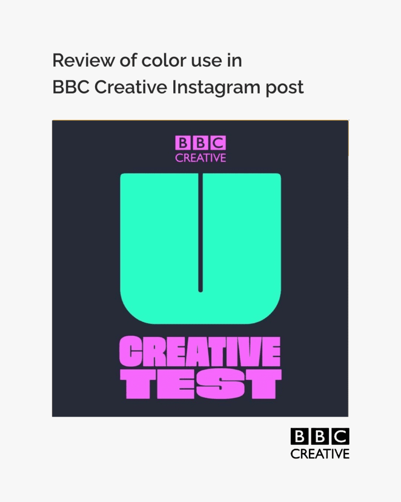
To explore this we review the colours used in an Instagram post by @bbccreative
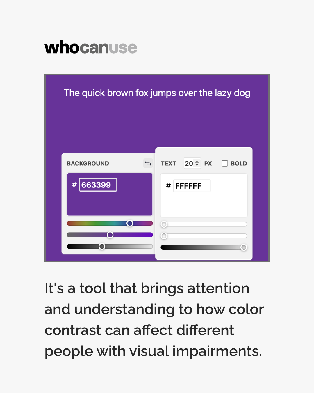
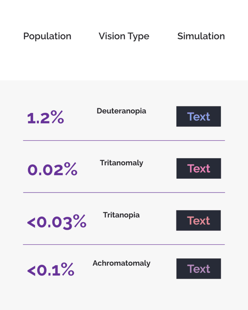
We looked at the colour combination used in the BBC Creative post with a tool from WhoCanUse. The tool lets you enter your colour combination.
It will then show you how the combination appears to people with different types of vision. It also lets you know what percentage of the population has each vision type.


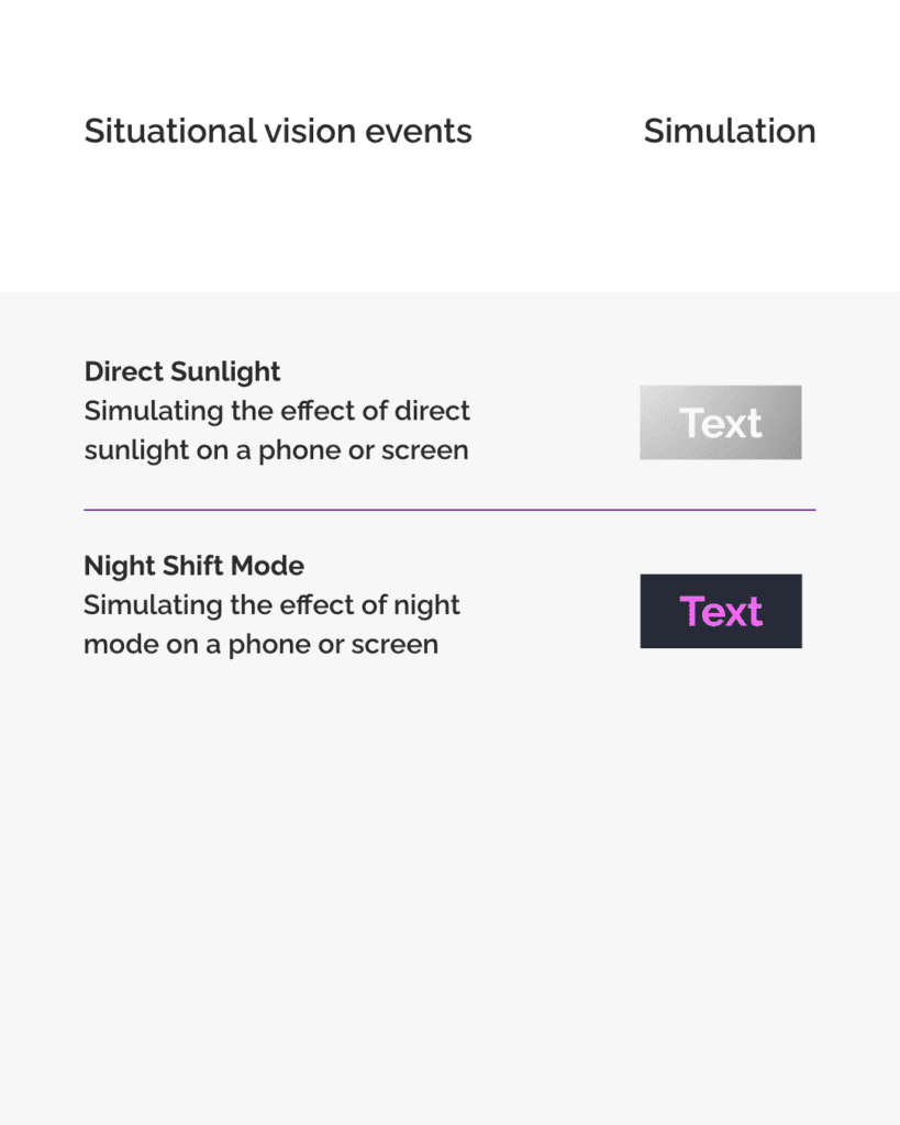
The tool also shows how the combination works in different situations and environments. You can see how well the combination will stand up in direct sunlight. WeCanUse also shows how the colours will look on a phone in night mode.
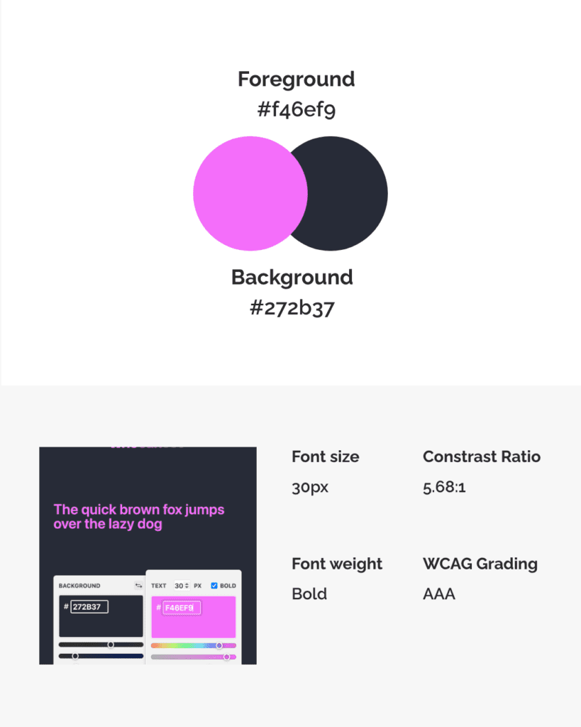
The tool shows us that the BBC’s post uses a high contrast ratio and meets the WCAG AAA standards.
Because BBC Creative used colours that contrast well the image is readable for many. It’s also readable in different situations and environments.
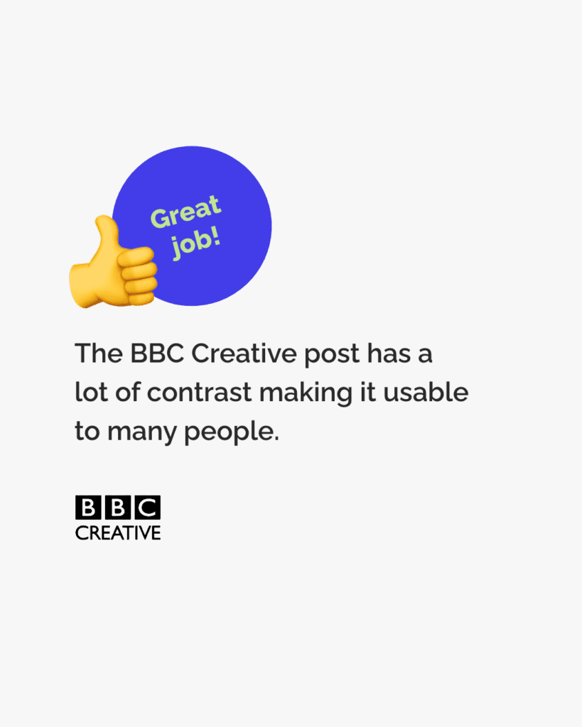
The post by BBC Creative is a good example of using contrasting colours to make posts accessible.
When creating content for digital spaces make sure you use contrasting colours. You can use the WhoCanUse tool to check who will be able to pick out the colours. Enter the colour codes to check the combination. If you don’t know the colour code you can use a tool like ColorPicker to find the code.
How to make sure your colour choices are accessible
By doing this you’ll be helping make your content and the internet as a whole more accessible to more people. Great job!
We hope you found this post helpful.
You can get early access to all our tips when you join we’re all human as a member and supporter. Check out our membership options here. They include access to exclusive resources to support you, plus cool anti-ableist merch!
-

You are so RUDE!
In this post, we’re all human’s Sabrina Tirvengadum reflects on her experience. Growing up hard of hearing/deaf leads many people to make unfair assumptions.

I wouldn’t consider myself a mean person, but I have been told on a number of occasions that I was/am rude, getting told off for ignoring someone or even for not blinking when I’m looking at their face (basically for staring). I can be rude to others, no doubt about that.
But what can you do when you have the skill to be rude by accident? There’s an awkwardness and a strange sense of guilt. I would always find myself asking the same questions:
How can I fix this?
Should I tell them?
Would they understand I am hard of hearing?
When I was in my teens, I would turn rouge if I didn’t quite hear what the guy I fancied said. The uncontrollable blushing would come through with my brown skin and it didn’t matter how much Sleek foundation I bought, there was no hiding it!
Even in the classrooms, the fear wasn’t about whether I knew the answer, but more of the embarrassment that I didn’t quite know what they were asking me.
I recently came back from a visit to Singapore. I couldn’t wear my hearing aid out there; sounds were magnified so much that I wouldn’t be able to hear anyone, so I didn’t wear it. But I still couldn’t hear, and I felt like people would think I was patronising them, mocking their accent on their land.
Pardon?”
“What?”
“Can you say that again?”
Should I say something or pretend I understand when they know I don’t?
The assumptions are there and you can’t shake them off because the response would always be, “why don’t you just wear your hearing aid then…? It’s rude!”
How do you explain to someone that you just can’t hear? Not long ago I met Lisa Kelly, poet and author of A Map Towards Fluency. It was the first time I met someone deaf like me who shared similar stories.
It was the first time I didn’t feel alone, didn’t question myself and felt understood. Her advice was to just tell them from the beginning. So here I am, trying to be proud, trying to be brave.
“Hey everyone, I’m not rude, I’m just deaf.”
-
Introduction to Web Accessibility by W3C
This course teaches web accessibility foundations, covering international standards, assistive technologies, business benefits, and W3C resources. It’s designed for developers, designers, content authors, project managers, and people with disabilities, with optional materials available for deeper learning.
-
Accessibility fundamentals by Microsoft
The Microsoft accessibility course has three modules that cover different aspects of accessibility. The first introduces core accessibility concepts, the second highlights accessibility features in Microsoft products, and the third shows how to create accessible content with Microsoft 365.
-
Web Accessibility by Google
This course teaches how to create accessible web applications, covering topics like screen reader compatibility, input focus, semantics, ARIA markup, and styling for partial vision.
-
Microsoft Ability Summit 2020
The 10th Microsoft Ability Summit brought disabled people & allies together to empower inclusion & accessibility. This was the first Microsoft Ability Summit to be virtual.
-
Inclusive design: Designing for deaf people helps everyone
Marie van Driessche discusses the need to understand disabilities as mismatched human interactions, rather than as an individual’s health conditions.
-
When we design for disability, we all benefit
Elise Roy explains that the energy put into designing for & by people with disabilities can benefit all of us. We shouldn’t just tolerate difference, we should embrace it.
-
Accessibility with Marcy Sutton
Marcy Sutton discusses the importance of including people with disabilities as stakeholders in building an accessible internet. She talks about what is at stake when we do not use accessibility.
-

Accessible images
This thorough guide by WebAIM covers using images to enhance understanding. You can also learn about how using color to convey meaning in images can cause problems. And crucially, how to avoid using graphics that cause seizures.