Which fonts are easiest to read?
Are you struggling to find an accessible font to ensure your content is inclusive? There’s a lot of discussion and disagreement about the best fonts for accessibility. Some fonts are easier to read than others, and there are a few good options. Here’s an example of a great font that we know is readable and accessible.
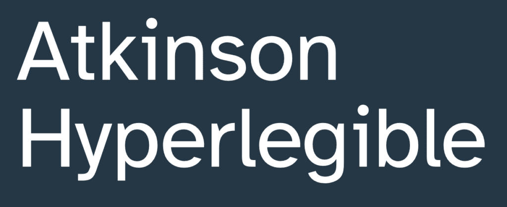
It’s called Atkinson Hyperlegible. Applied Design Works designed the font in partnership with the Braille Institute.
Atkinson Hyperlegible font is unique because it was designed to increase legibility. This is one of the reasons why it’s one of the best fonts for readability. And it’s free too!
Atkinson Hyperlegible font

Atkinson Hyperlegible is a sans-serif typeface. Read on to see how Atkinson Hyperlegible works and why it is so helpful. The font won Fast Company’s 2019 Innovation By Design Award.
An accessible font for visually impaired readers
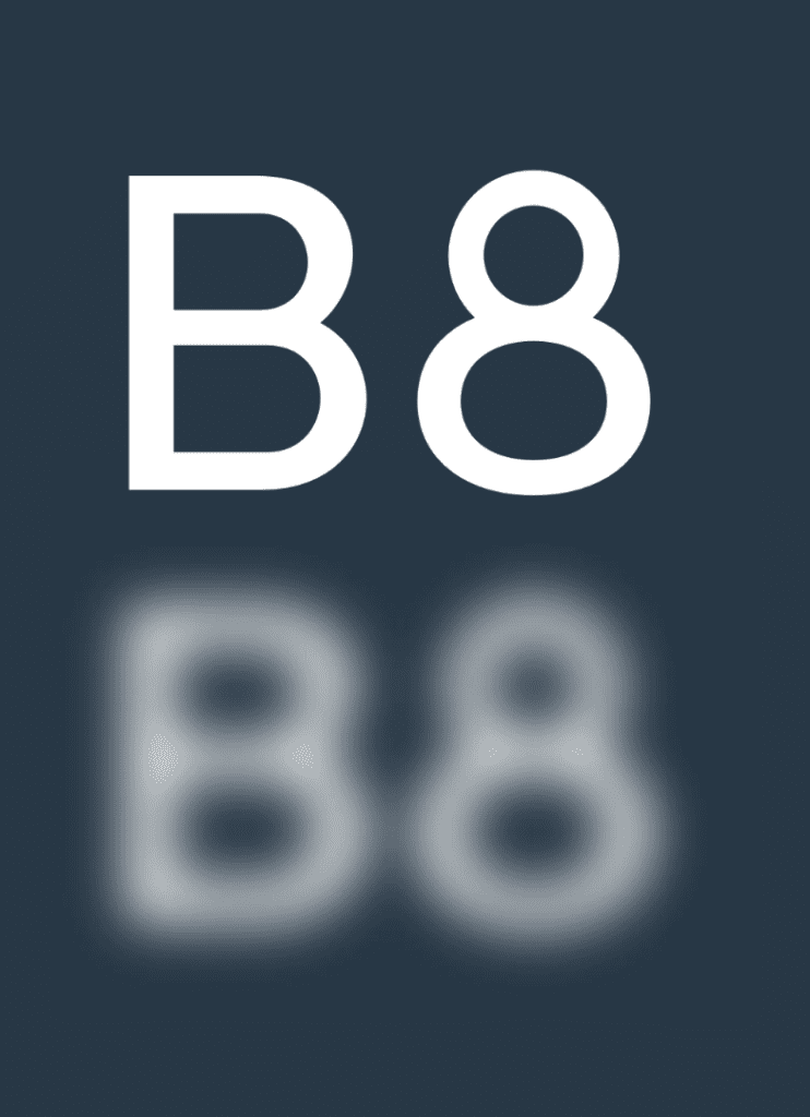
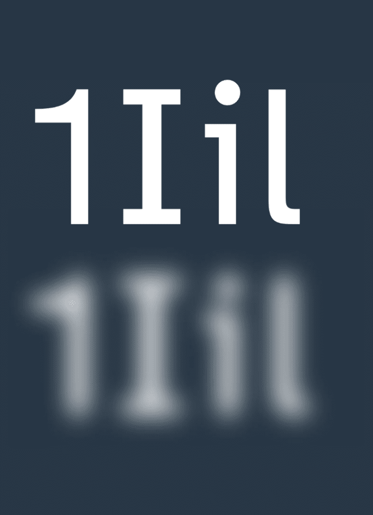
Low-vision readers can struggle with certain letters. Some numbers can also be hard to distinguish from each other. This typeface differentiates common misinterpreted letters & numbers using various design techniques.

Recognisable footprint
Character boundaries are clearly defined to ensure understanding across the visual spectrum.

Differentiated letterforms
Similar letter pairs are differentiated from each other to increase legibility dramatically.

Unambiguous characters
Unambiguous characters increase legibility for people with low vision. Being dyslexic can also make it more difficult to read letters which are similar in shape. So this also makes Atkinson Hyperlegible one of the best fonts for dyslexic people.

Exaggerated forms
These clarify potential misreadings.

Opened counterspace
These define open spaces better.

Angled spurs
These increase recognition and define distinctive styles.

Circular details
These link to the history of the Braille Institute and braille dots.
So should you use this font for accessible design?
Yes, we think so! The features outlined above help make the font one of the best fonts for visually impaired people. We recommend it for any of your publicity materials. This can include emails, website pages or social posts.
You can see Atkinson Hyperlegible in use on our website. We find it particularly great for use in headings.
Download the free font from Google fonts or from the Braille Institute.
Find out more about what matters when it comes to accessible typography here and about the all-important question of font size here.

