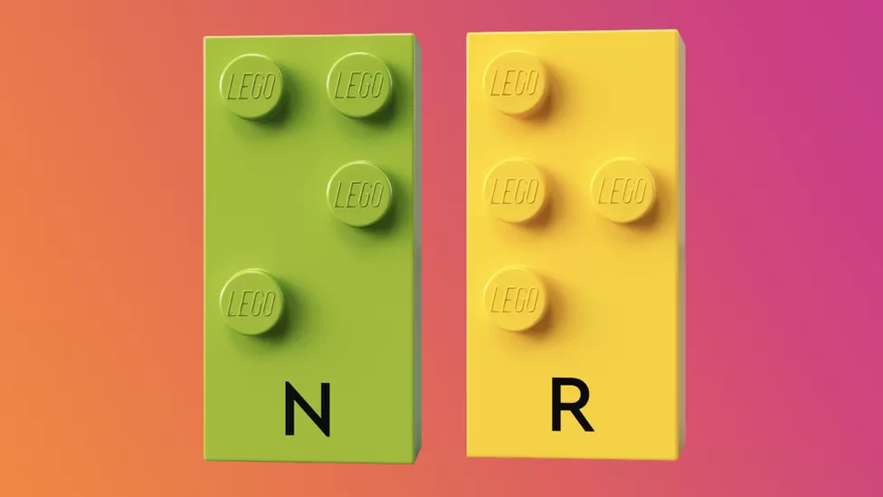
Reading, Writing, Arithmetic. These are the Three R’s of Education, even though only one word actually begins with the letter R.
But now Lego have stepped in to change things for the blind community and people with low vision, with the Three B’s.
Braille Building Bricks.
The Danish toy brand developed bricks with the help of blind organisations from all over the world, with the traditional studs on top forming individual letters and numbers in Braille.
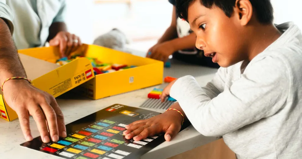
Lego first announced these bricks to the world in 2020, and gave them to schools to encourage children with a fun way to learn. Technology has made things easier, with text readers for example, but many say that having the option is always better. The European Blind Union says that having an understanding of Braille helps in higher levels of education and can lead to better jobs.
This September, Lego released packs for the public to buy in the UK, which they hope will lead to a closer bond between parents and children as they learn braille together. Available from Lego.com, packs of bricks come in five colours, have fun online classes to go along with them, and they can fit with other Lego sets.
Because Everything Is Awesome when you’re part of a team.
How you write can make your content easier or harder to read. But that’s not all that affects the readability of your content. Ensure your message is easy to access by making accessible typography choices.
Why does accessible typography matter?
Decisions about font style, type size and layout can make a huge difference. They can affect whether people can read and engage with your work or are not able to use it at all. Coming up we’ve got four quick and easy tips to make your typography accessible.
These can be applied to all your digital media or products. Use these tips on your website, on social media graphics, in ebooks and in any other content.
4 typography tips to make sure your audience gets your message
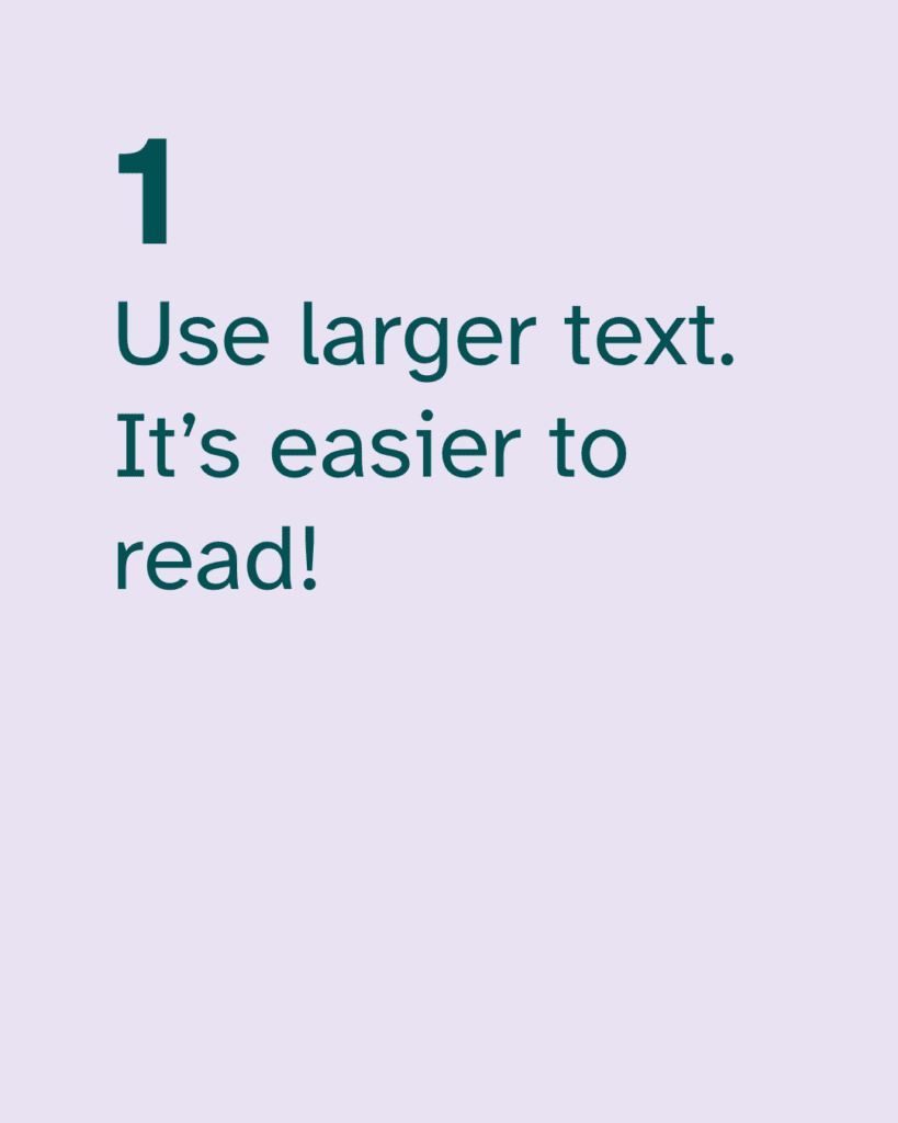
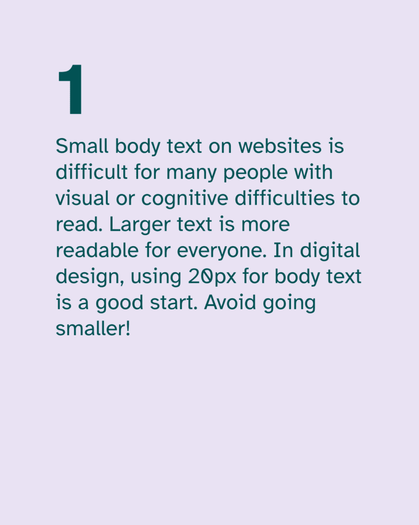
1. Use larger text. It’s easier to read!
This is such an easy change to make. It can make a quick and big difference in how accessible your content is. And yet many people will argue against this.
You might hear comments like “big text is clunky”, or “it’s childish”. Unfortunately, this is an ableist attitude that is all too common. Let’s prioritise accessibility so that your audience can engage with your work.
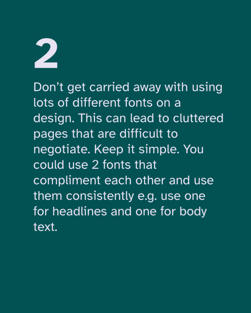
With so many font options out there, it can be tempting to use lots of different fonts on a website page or social post. But this can be distracting and make it harder for people to read your text.
Don’t get carried away with using lots of different fonts on a design. This can lead to cluttered pages that are difficult to negotiate.
Keep it simple. You could use 2 fonts that complement each other and use them consistently. For example, use one for headlines and one for body text.
3. Common fonts can be accessible fonts
Again with lots of exciting new fonts to choose from, we can forget that familiarity is not a bad thing. There is a lot of debate about which are the best fonts for accessibility.
When it comes to choosing, go for common fonts that many readers will be familiar with reading in. These include sans-serif fonts like Arial, Calibri, Century Gothic and Tahoma. Common serif fonts include Times New Roman and Georgia.
4. Avoid fonts that don’t have distinct characters
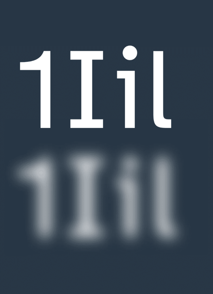
Some fonts don’t have distinct characters. For example in Gill Sans, I, l and 1 look exactly the same. This makes the text more difficult to read for many people.
And if the letters b and d are too similar in shape, readers can confuse them. Look for fonts that have distinct characters like PT Mono or Comic Sans.
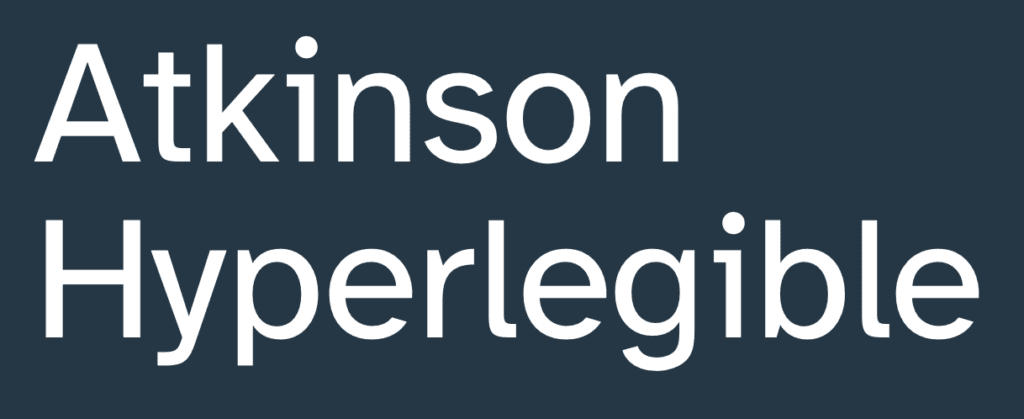
We also recommend a font called Atkinson Hyperlegible, which is specially designed to have highly distinctive characters. Find out about this accessible font here.
Follow these four tips to help you make your content inclusive. Accessible typography makes digital spaces easier to use for many people. This can include dyslexic and other neurodivergent people, plus people with visual conditions.
We’ve got lots more info on typography accessibility coming soon. Look out for information in our resources and on our blog.
Are you struggling to find an accessible font to ensure your content is inclusive? There’s a lot of discussion and disagreement about the best fonts for accessibility. Some fonts are easier to read than others, and there are a few good options. Here’s an example of a great font that we know is readable and accessible.
It’s called Atkinson Hyperlegible. Applied Design Works designed the font in partnership with the Braille Institute.
Atkinson Hyperlegible font is unique because it was designed to increase legibility. This is one of the reasons why it’s one of the best fonts for readability. And it’s free too!
Atkinson Hyperlegible font
Atkinson Hyperlegible is a sans-serif typeface. Read on to see how Atkinson Hyperlegible works and why it is so helpful. The font won Fast Company’s 2019 Innovation By Design Award.
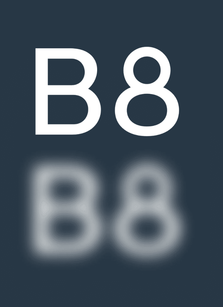
An accessible font for visually impaired readers
Low-vision readers can struggle with certain letters. Some numbers can also be hard to distinguish from each other. This typeface differentiates common misinterpreted letters & numbers using various design techniques.
Recognisable footprint
Character boundaries are clearly defined to ensure understanding across the visual spectrum.
Differentiated letterforms
Similar letter pairs are differentiated from each other to increase legibility dramatically.
Unambiguous characters
Unambiguous characters increase legibility for people with low vision. Being dyslexic can also make it more difficult to read letters which are similar in shape. So this also makes Atkinson Hyperlegible one of the best fonts for dyslexic people.
Exaggerated forms
These clarify potential misreadings.
Opened counterspace
These define open spaces better.
Angled spurs
These increase recognition and define distinctive styles.
Circular details
These link to the history of the Braille Institute and braille dots.
So should you use this font for accessible design?
Yes, we think so! The features outlined above help make the font one of the best fonts for visually impaired people. We recommend it for any of your publicity materials. This can include emails, website pages or social posts.
You can see Atkinson Hyperlegible in use on our website. We find it particularly great for use in headings.
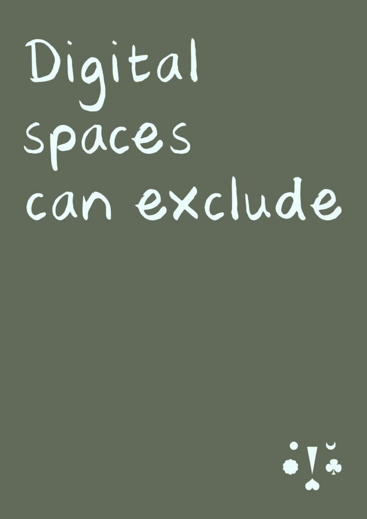
Accessibility and inclusion aren’t only about physical access to buildings and facilities. Inclusive design in digital spaces is crucial too. Many websites create barriers so disabled people cannot use them.
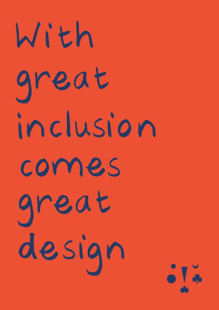
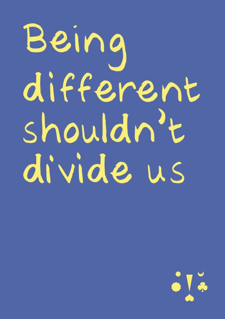
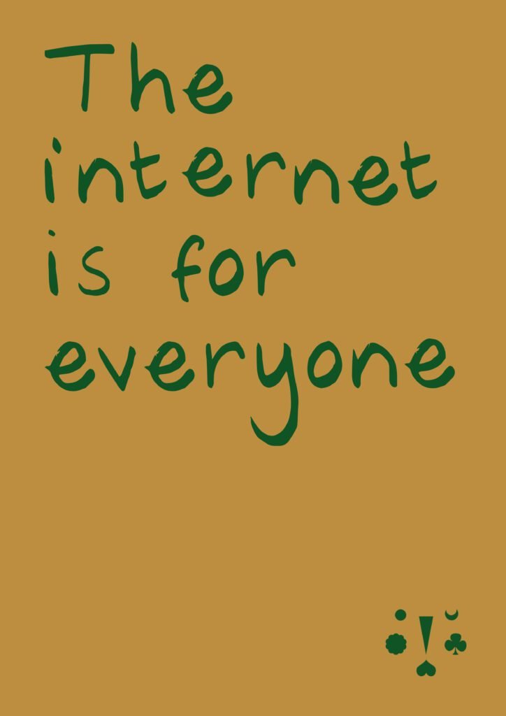
We created a series of quotable posters for a community art competition by Wiilma. We want the posters to start conversations about accessibility in the digital world.
There are lots of ways that we can design digital spaces to remove barriers that cause exclusion. And by creating with inclusion in mind, design becomes more valuable. Our contribution can be much greater, and celebrating differences can bring us together.
Just as great power needs responsibility, great inclusion comes with great design. Design can be that much greater when it’s inclusive.
The internet should be accessible to all. At we’re all human we help creators, businesses and organisations use inclusive design. Join us to get tips and resources to make your digital presence accessible. Find out more on our Patreon page.
Using contrasting colours is an easy way to make your content more accessible. Colour-blind people will be able to access your content. People with other visual disabilities will also find it more readable.
When you create a social post or any other digital resource for your audience keep this in mind. You’ll be improving the accessibility of your online presence.
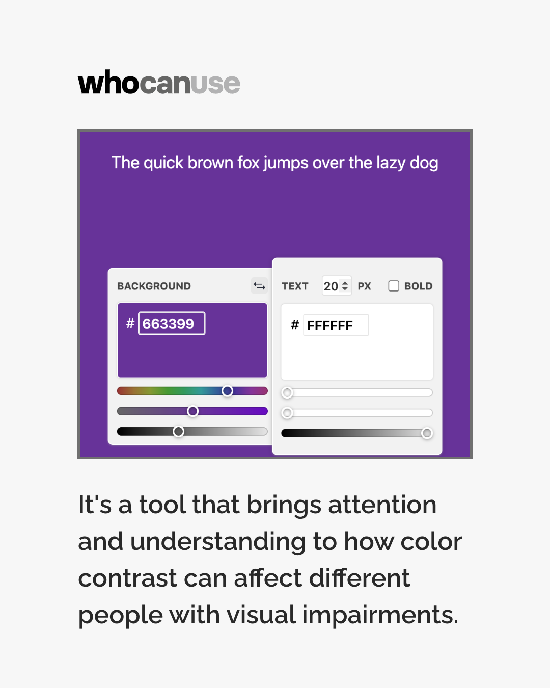
In this post, we explore the WhoCanUse tool. We look at how useful it could be in helping you identify accessible colour combinations. When you find a good combination you can use it with confidence for your content!
Accessible content in action
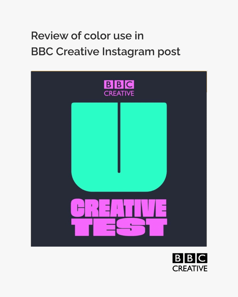
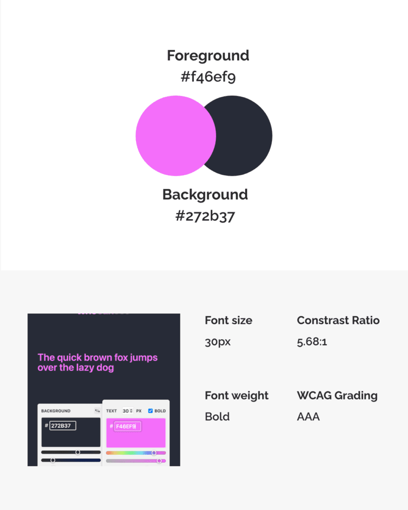
To explore this we review the colours used in an Instagram post by @bbccreative
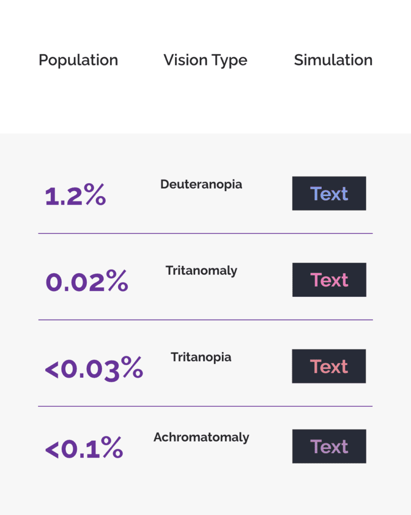
We looked at the colour combination used in the BBC Creative post with a tool from WhoCanUse. The tool lets you enter your colour combination.
It will then show you how the combination appears to people with different types of vision. It also lets you know what percentage of the population has each vision type.
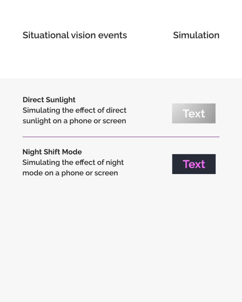
The tool also shows how the combination works in different situations and environments. You can see how well the combination will stand up in direct sunlight. WeCanUse also shows how the colours will look on a phone in night mode.
The tool shows us that the BBC’s post uses a high contrast ratio and meets the WCAG AAA standards.
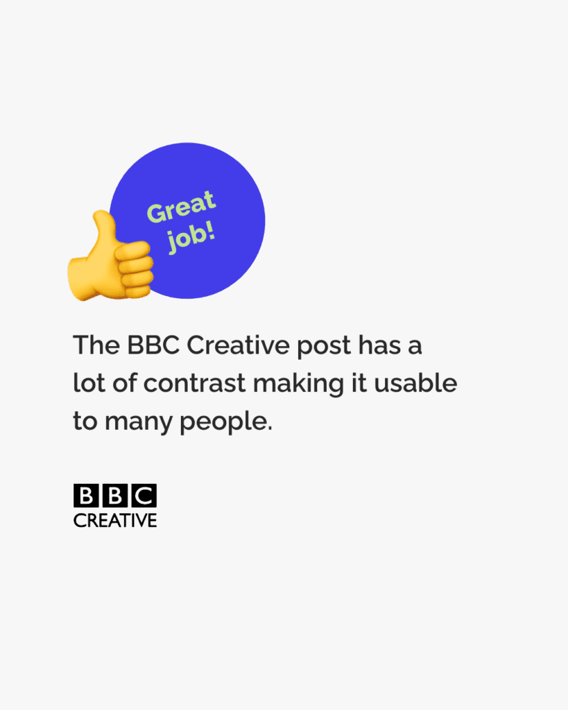
Because BBC Creative used colours that contrast well the image is readable for many. It’s also readable in different situations and environments.
The post by BBC Creative is a good example of using contrasting colours to make posts accessible.
When creating content for digital spaces make sure you use contrasting colours. You can use the WhoCanUse tool to check who will be able to pick out the colours. Enter the colour codes to check the combination. If you don’t know the colour code you can use a tool like ColorPicker to find the code.
How to make sure your colour choices are accessible
By doing this you’ll be helping make your content and the internet as a whole more accessible to more people. Great job!
We hope you found this post helpful.
You can get early access to all our tips when you join we’re all human as a member and supporter. Check out our membership options here. They include access to exclusive resources to support you, plus cool anti-ableist merch!
We use cookies to ensure that we give you the best experience on our website. If you continue to use this site we will assume that you are happy with it.