A purple circle with the text Great job written in pale green over it. A yellow thumbs up by it.

Use contrast & make your posts more accessible

Using contrasting colours is an easy way to make your content more accessible. Colour-blind people will be able to access your content. People with other visual disabilities will also find it more readable.

When you create a social post or any other digital resource for your audience keep this in mind. You’ll be improving the accessibility of your online presence.

In this post, we explore the WhoCanUse tool. We look at how useful it could be in helping you identify accessible colour combinations. When you find a good combination you can use it with confidence for your content!

Accessible content in action

Text reads “Review of color use in BBC Creative Instagram post”. Below is an image of a post by BBC Creative. The BBC Creative logo is picked out in bright pink magenta against a black background. Below is a bright (almost neon) green shape. The shape is like a square but has rounded corners. It resembles a chunky stylised capital U. Below the green shape text in magenta reads “Creative test” in chunky capitalised type. Below the black box text is the BBC Creative logo.

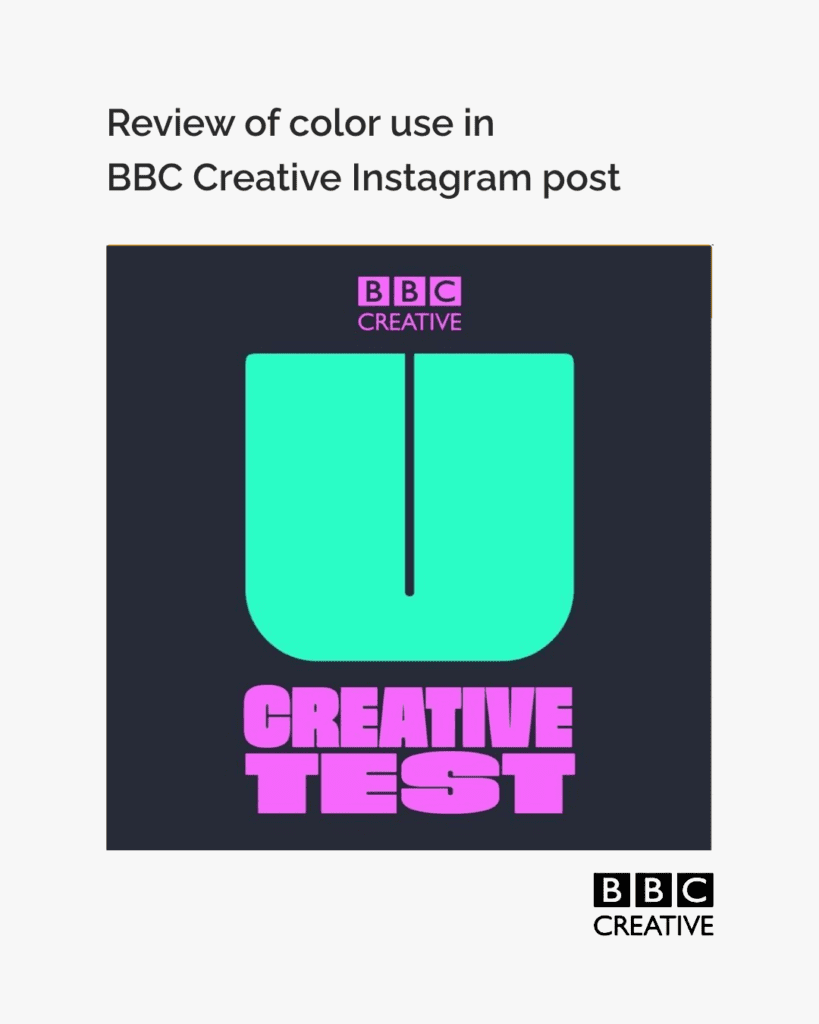
To explore this we review the colours used in an Instagram post by @bbccreative
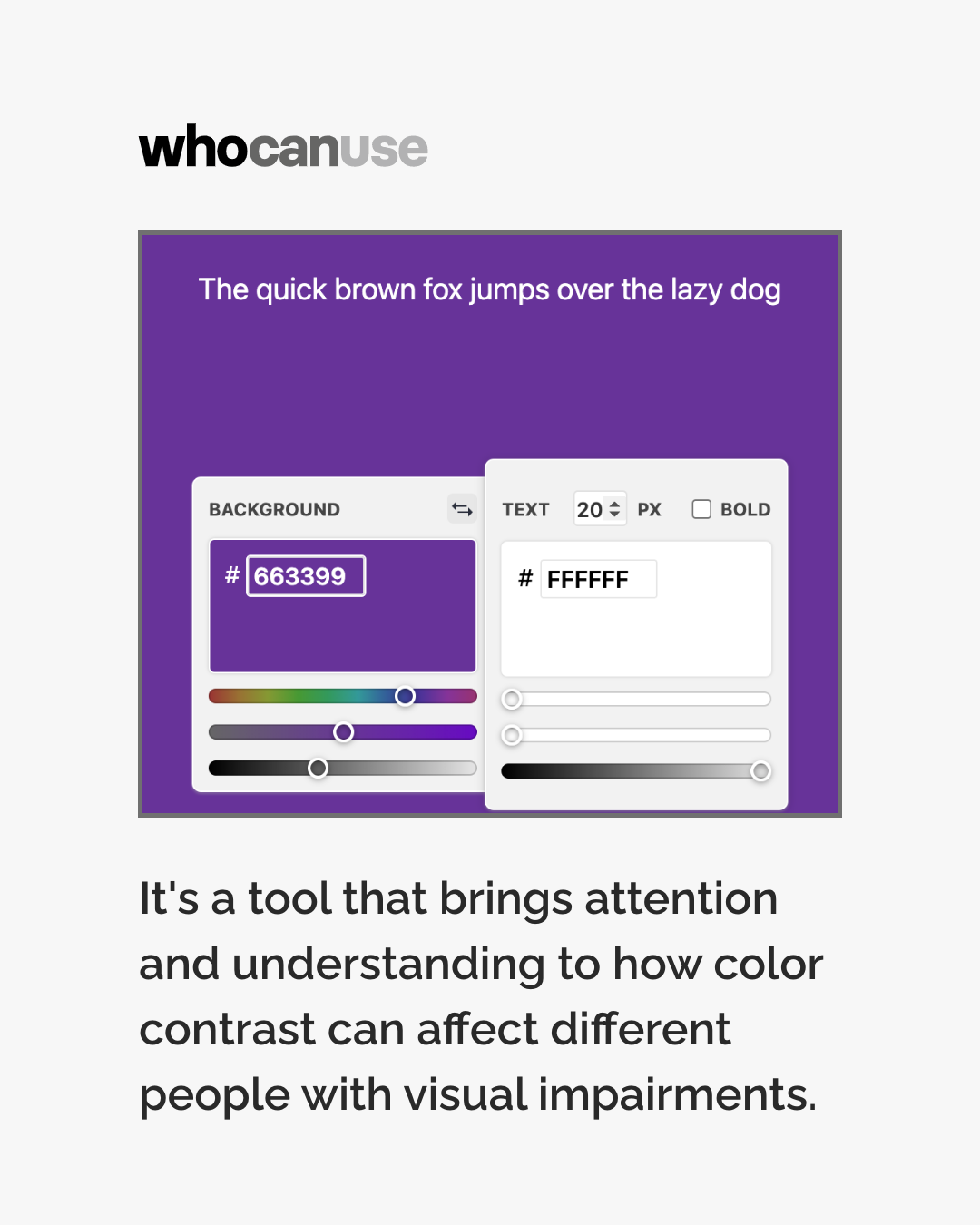
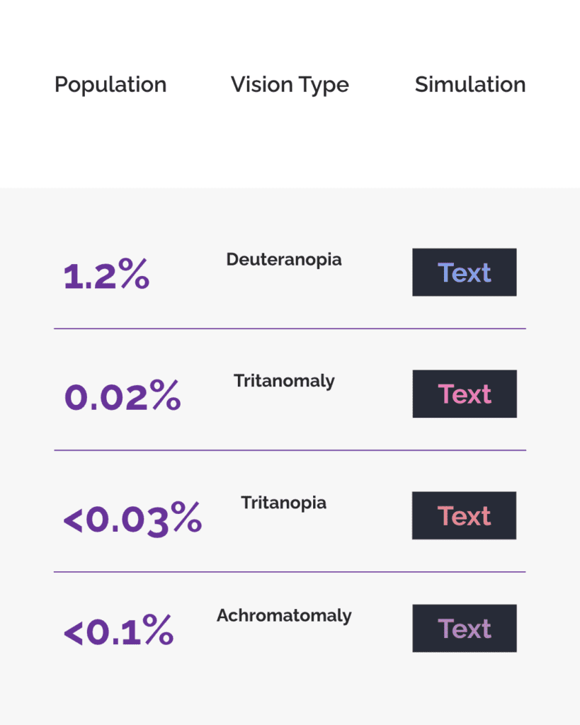
A screenshot of the WhoCanUse tool. Text reads “We used tools from WhoCanUse.com to check the colour combination used in this post. This nifty tool shows how people with different vision can use this combination, and what percentage of the population they make up.”
The black and pink colors used in the BBC Creative post are shown in circles that overlap on a white background. Text describes the hex colours used, “Foreground #f46efg”. and “Background #272b37”. A screenshot of the WhoCanUse tool is also shown. Text shows the pink foreground color used and reads “The quick brown fox jumps over the lazy dog” on the same black used in the BBC Creative post. Colour swatches show the colour hexes used. Black text on a white background below the screenshot reads “Font size 30px, Font weight Bold, Contrast Ratio 5.68:1, WCAG Grading AAA”.

It will then show you how the combination appears to people with different types of vision. It also lets you know what percentage of the population has each vision type.

A table view of information shows the percentage of the population that experiences different vision, the name of the type of vision and a simulation of the color combination used in the BBC Creative post. The table shows 68% of people have Regular Vision, (Trichromatic).
1.3% of the population have Protanomaly vision. 1.5% of people have Protanopia. 5.3% of people have Deuteranomaly.
A table view of information shows the percentage of the population that experiences different vision, the name of the type of vision and a simulation of the color combination used in the BBC Creative post. 1.2% of people have Deuteranopia. 0.02% of the population have Tritanomaly vision. <0.03% of people have Tritanopia. <0.1% of people have Achromatomaly.
As the previous posts, a table view of information shows the percentage of the population that experiences different vision, the name of the type of vision and a simulation of the color combination used in the BBC Creative post. The first row shows 1.2% of people have Achromatopsia. The second row shows that 33% of the population have Cataracts. The third row shows that 2% of people have Glaucoma. The fourth row shows that 31% of people have Low Vision.

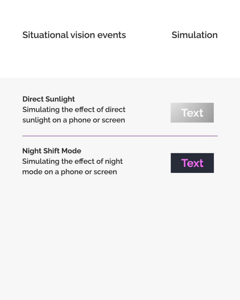
The tool also shows how the combination works in different situations and environments. You can see how well the combination will stand up in direct sunlight. WeCanUse also shows how the colours will look on a phone in night mode.

A table view of information shows simulations of the color combination used in the BBC Creative post in different situations. The first row shows the effect of Direct Sunlight when using the color combination. The second row shows the effect of Night Shift Mode when using the combination.

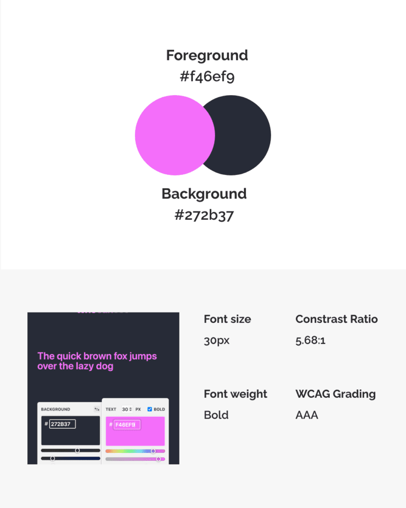
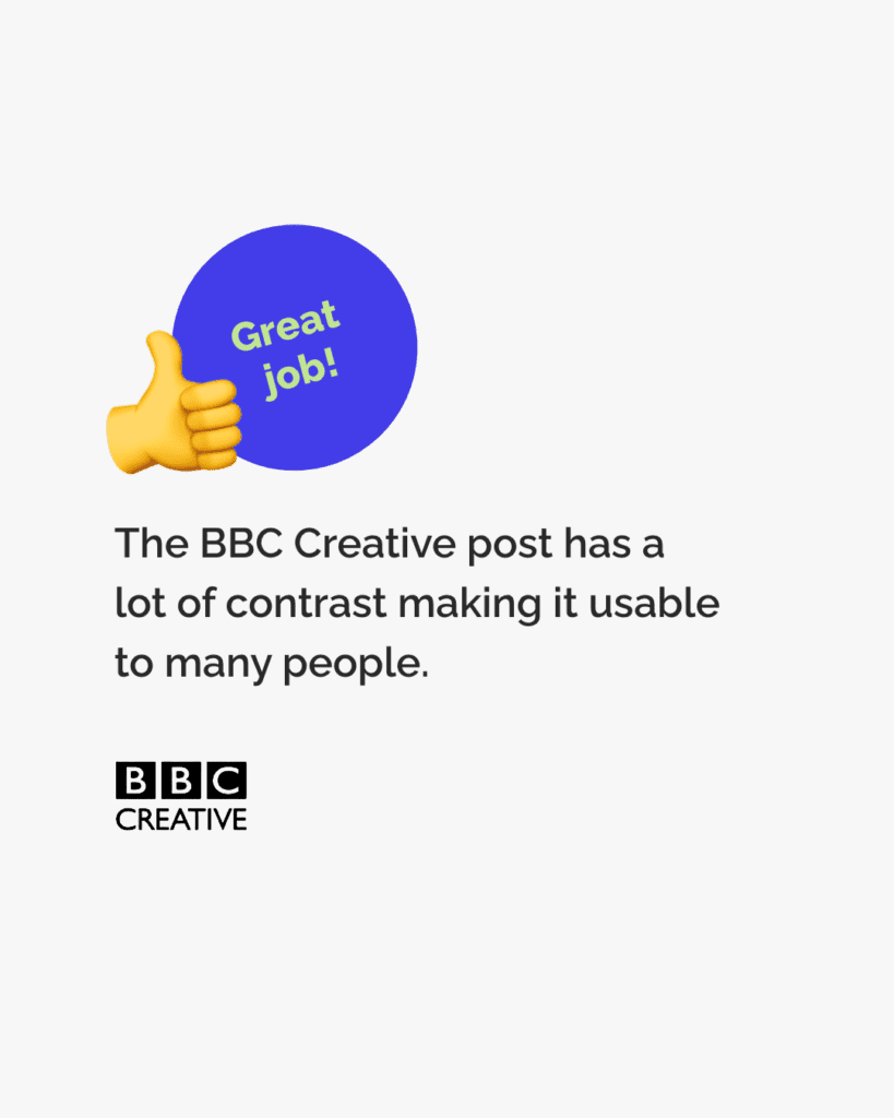
The tool shows us that the BBC’s post uses a high contrast ratio and meets the WCAG AAA standards.

Because BBC Creative used colours that contrast well the image is readable for many. It’s also readable in different situations and environments.

A deep blue/purple circle is accompanied by a yellow emoji thumbs up. Text within the circle reads “Great job!” Text reads, “The BBC Creative post has a lot of contrast making it usable to many people.” Below the text sits the BBC Creative logo in black and white.

The post by BBC Creative is a good example of using contrasting colours to make posts accessible.

When creating content for digital spaces make sure you use contrasting colours. You can use the WhoCanUse tool to check who will be able to pick out the colours. Enter the colour codes to check the combination. If you don’t know the colour code you can use a tool like ColorPicker to find the code.

How to make sure your colour choices are accessible

By doing this you’ll be helping make your content and the internet as a whole more accessible to more people. Great job!

We hope you found this post helpful.


Posted

in

,

by

Tags: