How you write can make your content easier or harder to read. But that’s not all that affects the readability of your content. Ensure your message is easy to access by making accessible typography choices.
Why does accessible typography matter?
Decisions about font style, type size and layout can make a huge difference. They can affect whether people can read and engage with your work or are not able to use it at all. Coming up we’ve got four quick and easy tips to make your typography accessible.
These can be applied to all your digital media or products. Use these tips on your website, on social media graphics, in ebooks and in any other content.
4 typography tips to make sure your audience gets your message
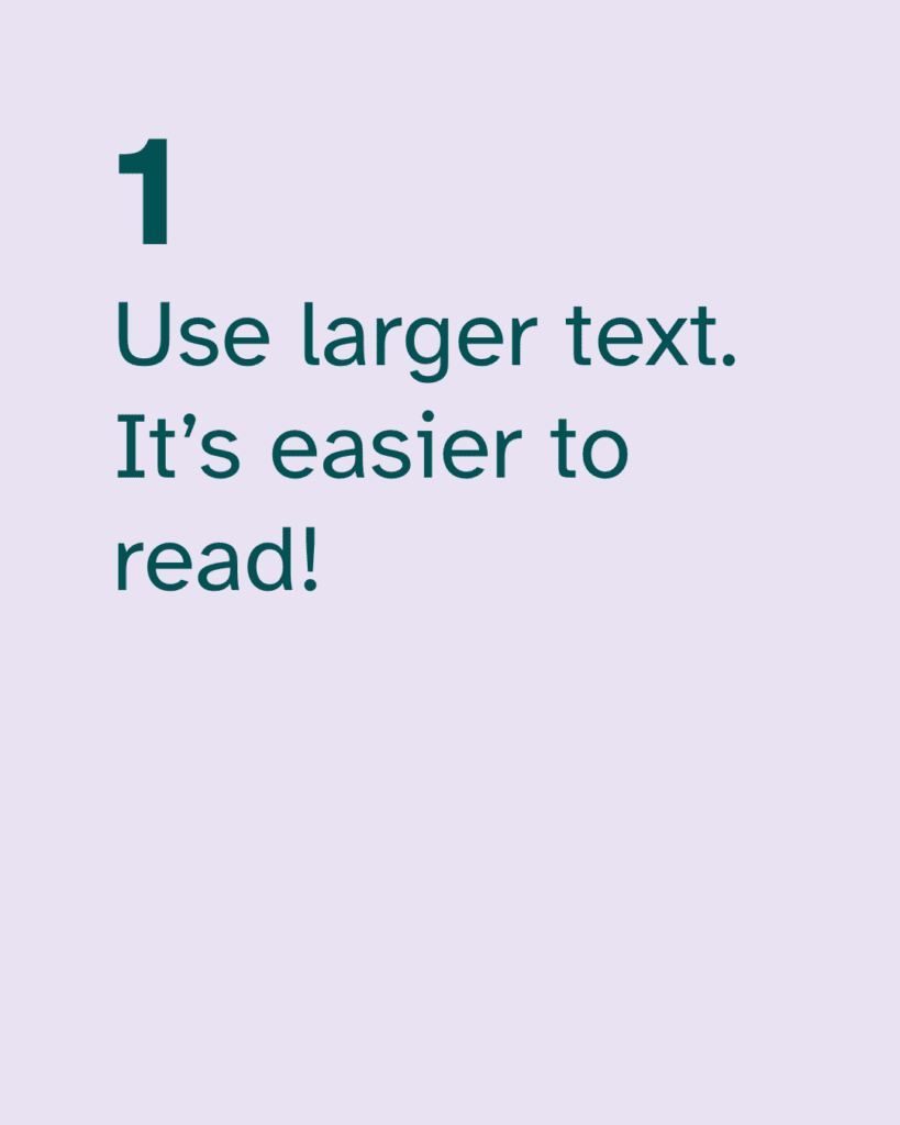
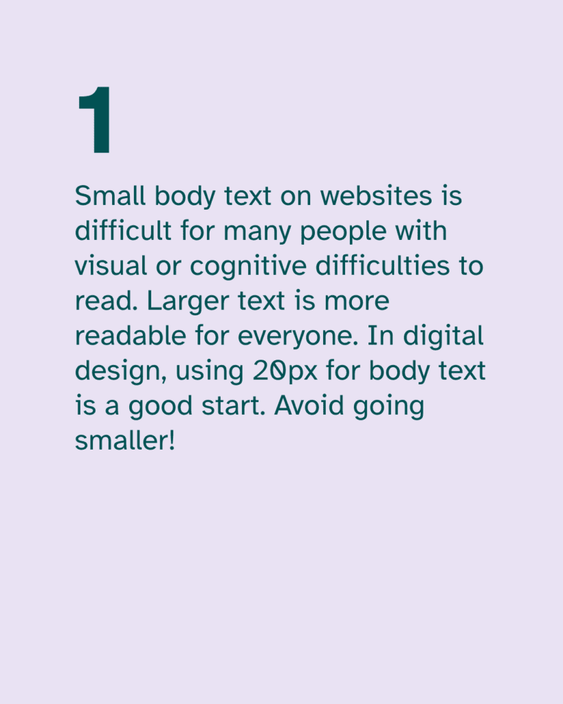
1. Use larger text. It’s easier to read!
This is such an easy change to make. It can make a quick and big difference in how accessible your content is. And yet many people will argue against this.
You might hear comments like “big text is clunky”, or “it’s childish”. Unfortunately, this is an ableist attitude that is all too common. Let’s prioritise accessibility so that your audience can engage with your work.
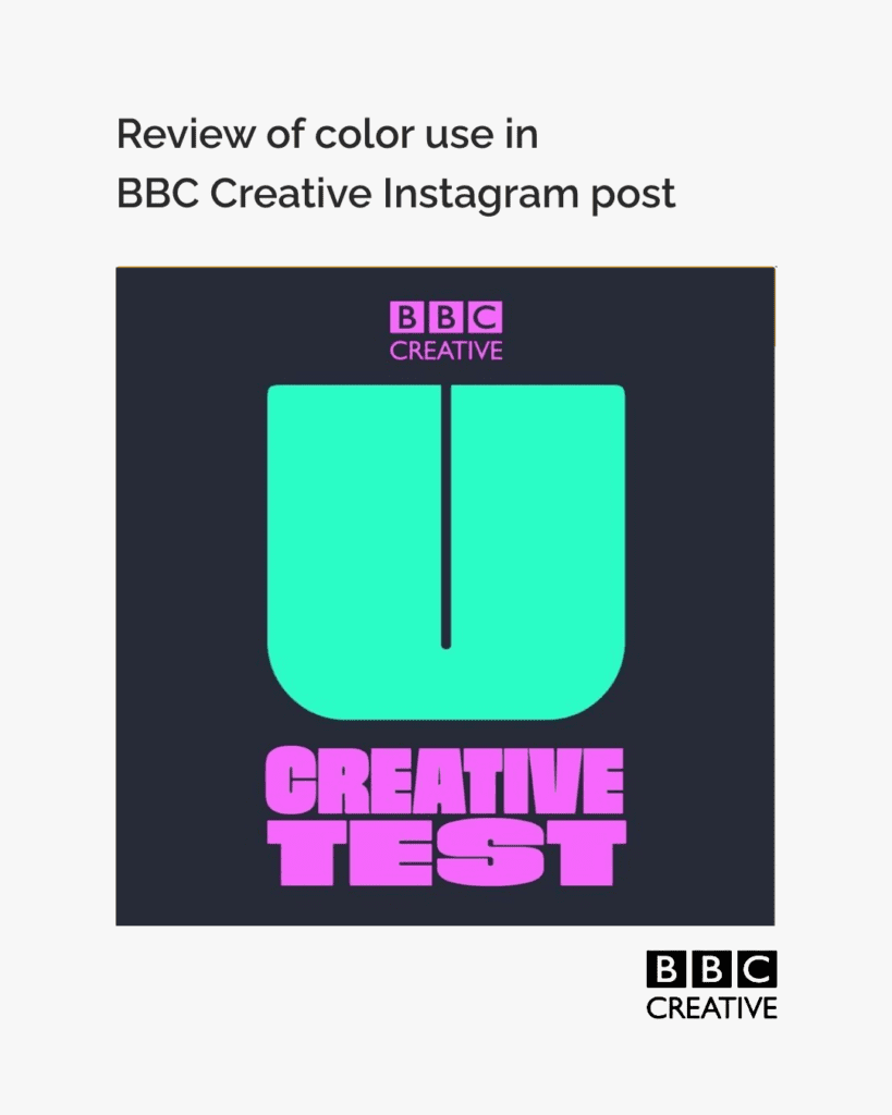
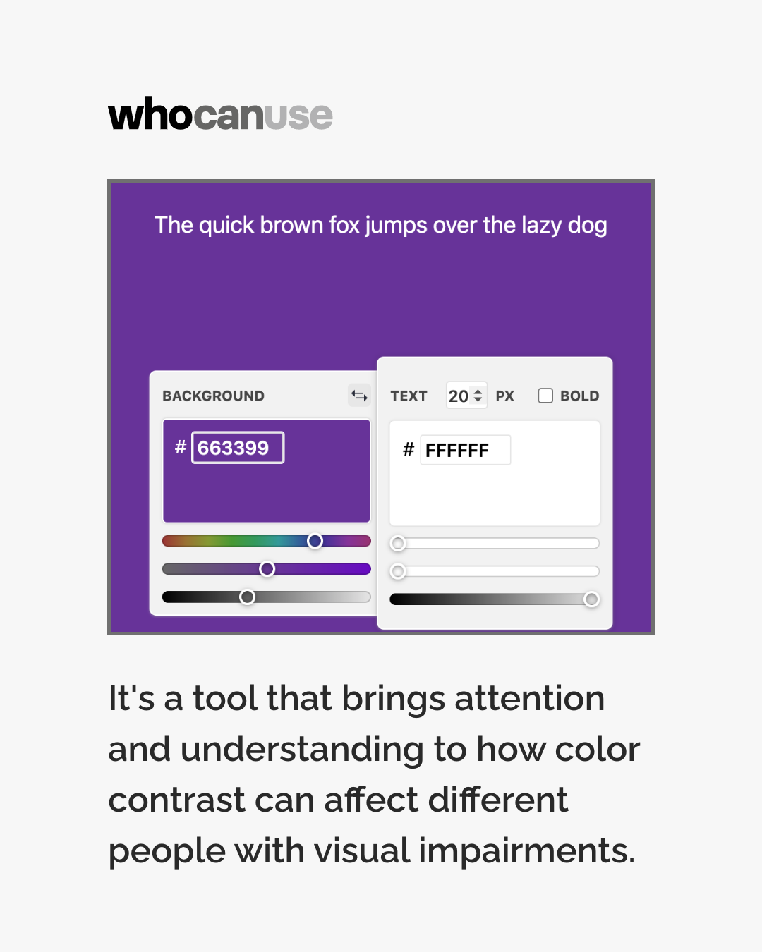
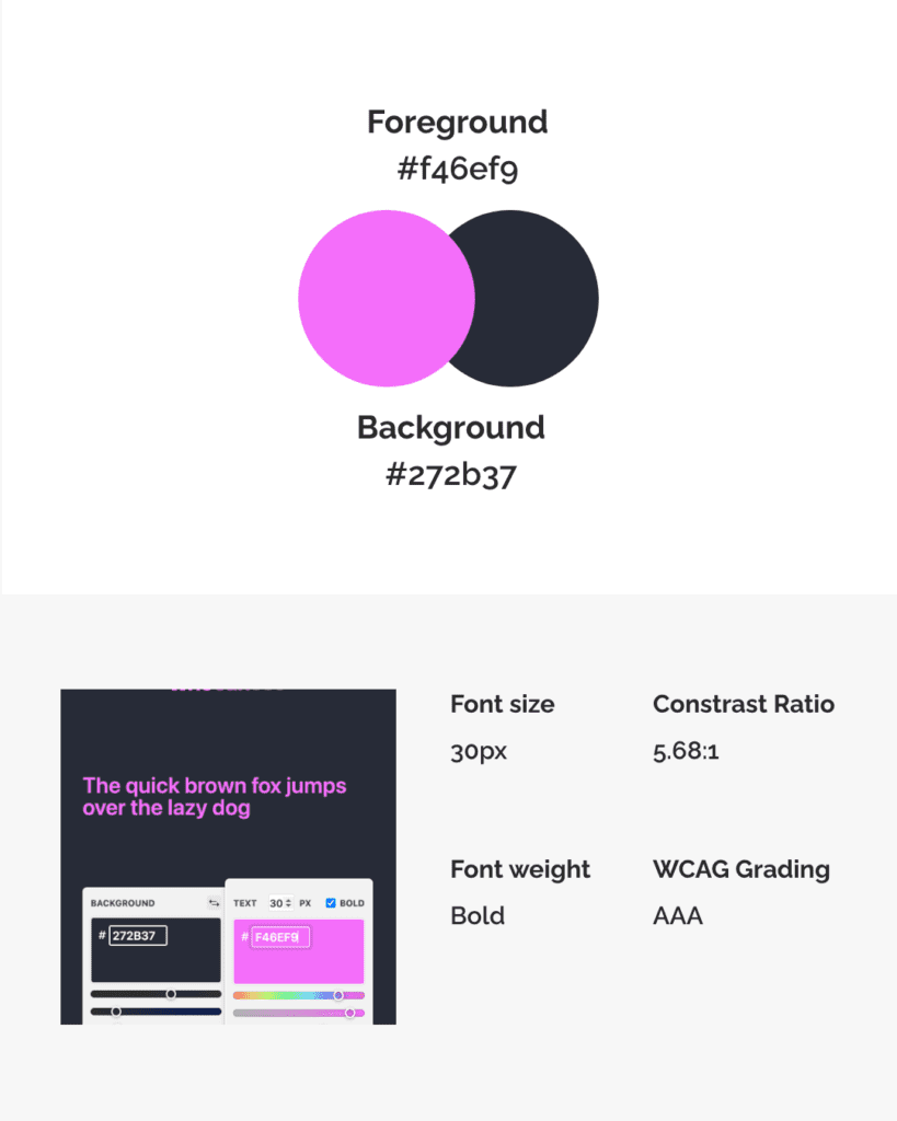
The bottom line is that small body text on websites is difficult for many people to read. Larger text is more readable for everyone. In digital design, using 20px for body text is a good start. Avoid going smaller.
2. Don’t use lots of different fonts!
With so many font options out there, it can be tempting to use lots of different fonts on a website page or social post. But this can be distracting and make it harder for people to read your text.
Don’t get carried away with using lots of different fonts on a design. This can lead to cluttered pages that are difficult to negotiate.
Keep it simple. You could use 2 fonts that complement each other and use them consistently. For example, use one for headlines and one for body text.

3. Common fonts can be accessible fonts
Again with lots of exciting new fonts to choose from, we can forget that familiarity is not a bad thing. There is a lot of debate about which are the best fonts for accessibility.
Different disabled people may have preferences for different fonts. While no one best font suits everyone, familiar fonts are often easier for most people to read.
When it comes to choosing, go for common fonts that many readers will be familiar with reading in. These include sans-serif fonts like Arial, Calibri, Century Gothic and Tahoma. Common serif fonts include Times New Roman and Georgia.


4. Avoid fonts that don’t have distinct characters
Some fonts don’t have distinct characters. For example in Gill Sans, I, l and 1 look exactly the same. This makes the text more difficult to read for many people.
And if the letters b and d are too similar in shape, readers can confuse them. Look for fonts that have distinct characters like PT Mono or Comic Sans.


We also recommend a font called Atkinson Hyperlegible, which is specially designed to have highly distinctive characters. Find out about this accessible font here.
Follow these four tips to help you make your content inclusive. Accessible typography makes digital spaces easier to use for many people. This can include dyslexic and other neurodivergent people, plus people with visual conditions.
We’ve got lots more info on typography accessibility coming soon. Look out for information in our resources and on our blog.